Mekai UI · · 5 min read
Mekai UI: 50 new animated React components, 5 of them free
What is new in Mekai UI: 50 components for apps, forms, game UI and backgrounds, with live captures, the five free ones, the prices and how to install them.
What is new in Mekai UI?
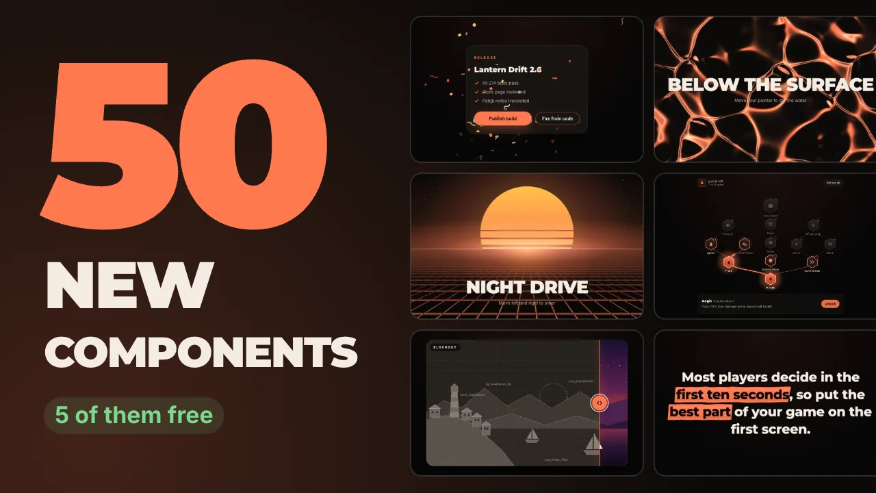
Fifty new components, which takes the library to 167: 53 free under the MIT license and 114 Pro. They are React, TypeScript, Tailwind CSS and Motion, and every one has a live preview on its page. The animation shows six of the new ones moving. Each tile is a real capture of the component running on the new build, not a mockup.
The 50 are spread over every category: 8 for app interfaces, 7 each for backgrounds and effects, 6 each for text, forms, galleries and game interfaces, and 4 full page sections. The rest of this post goes through them by what you would use them for.
Which of the new components are free?
Five, and they install with one command each: Highlighter Text, Scroll Progress Ring, Constellation, Before After and Skeleton Loader.
npx shadcn@latest add https://ui.mekaigames.com/r/before-after.json- Highlighter Text draws a marker stroke behind chosen words when they scroll into view. With reduced motion the marker is simply there.
- Scroll Progress Ring is a floating ring that fills as the page is read and becomes a back-to-top button at the end.
- Constellation is a canvas of drifting points that connect when they come close and move out of the pointer's way.
- Before After is a comparison slider you drag, tap or move with the arrow keys, side by side or stacked.
- Skeleton Loader composes skeleton shapes under one shimmer and cross-fades into the real content, easing the height so nothing below jumps.
What are the new animated backgrounds, and what do they cost?
Seven: Constellation (free), Retro Grid, Pixel Rain, Hex Pulse, Voronoi Cells, Fog Drift and Caustics. Three of them draw with WebGL shaders (Voronoi Cells, Fog Drift and Caustics) and the other four do not use WebGL.
A moving background is not free to run, and the cost depends on how it is drawn. In a test on one Mac, the canvas version of Constellation kept the browser's main thread busy for about 50 ms of every second while visible, and about 0.05 ms once it was scrolled off screen, because it pauses itself. The numbers, the method and the limits are in animated React hero backgrounds without hurting LCP.
Every one of these respects reduced motion in code. The pattern is described in prefers-reduced-motion in React.
What is new for app interfaces and forms?
App UI gets eight: a Cmd/Ctrl+K Command Palette with fuzzy search, a drag and drop Kanban Board with a keyboard alternative, an Activity Timeline whose line draws as you scroll, an Onboarding Tour, a Collapsible Sidebar, a Chat Thread, a Context Menu with submenus, and the free Skeleton Loader.
Forms gets six: Color Picker, Date Picker, Combobox, Signature Pad, Payment Card Form and Rotary Knob. The Date Picker uses no date library and keeps dates as plain YYYY-MM-DD strings. The Combobox follows the ARIA combobox pattern. The Payment Card Form is display only: real card entry has to go through your payment provider's hosted fields, and the component says so.
On accessibility: 49 of the 50 new components contain explicit reduced motion handling in their source. The exception is Color Picker, whose only motion is short color and hover scale transitions. Handling in code is not a test result, so check keyboard and screen reader behavior in your own app.
What is new for game interfaces, galleries and page sections?
Game UI gets six: an Inventory Grid with drag between slots, a Quest Tracker, a Skill Tree with prerequisites, a canvas Minimap with fog of war, Damage Numbers fired from a spawn() call, and a Level Up Banner that queues several level-ups in order.
Galleries get six: the free Before After, Polaroid Stack, Cover Flow, a Pinned Horizontal Gallery that pins while vertical scrolling moves a row sideways (small screens and reduced motion get native sideways scrolling), Hover Preview List and Lightbox.
Four blocks are whole sections: a pricing section, a testimonial wall, an FAQ with search, and a call to action above a footer. Text gets Redaction Reveal, Slot Text, Ink Bleed Text, Neon Flicker Text, Line Mask Headline and the free Highlighter Text.
How do you try them?
Every component page at https://ui.mekaigames.com/components/<slug> has a live preview with controls, and the free ones show their code. To install a free one, use the shadcn CLI as in the section above. The install walkthrough covers what the command changes in your project and the errors you may meet.
The free components are in the Mekai UI repository on GitHub. If a free component saves you an afternoon, a star on that repository is the simplest way to help other developers find it.
What does Pro cost?
Pro is €31.20 once for one developer, and Team is €159.20 once for up to 10, both with the launch offer. The regular prices are €39 and €199. There is no subscription: you pay once and get the 114 Pro components plus the ones added later, as source in a private GitHub repository. These prices are as of November 2026. Check the pricing page for the current offer before you buy.
Whether you want a package or source files is a separate question. Copy-paste components vs a UI library lays out when each one wins, with measured bundle sizes, including cases where a package is the better choice.
Questions people ask
- How many components does Mekai UI have now?
- 167: 53 free under the MIT license and 114 in Pro. The latest release added 50, of which 5 are free.
- Do the animated components work without Motion?
- No. They are built on Motion for React, and the CLI installs it for you when a component needs it. Some components only use its
useReducedMotionhook, which adds well under 1 KB. - Can I try a component before paying for Pro?
- Yes. Every component page has a live preview with controls, including the Pro ones. Only the source of the Pro components is private.