Mekai UI · · 6 min read
Mekai UI: animated React components, text effects and backgrounds
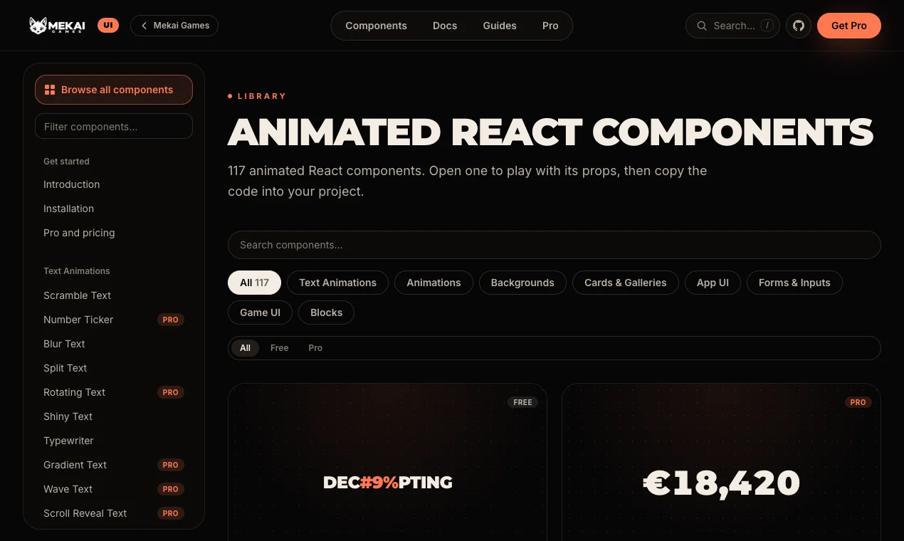
Mekai UI is our library of 117 animated React components for Tailwind CSS and Motion: text effects, backgrounds, game UI and blocks, with 48 free under MIT.
Components with game feel
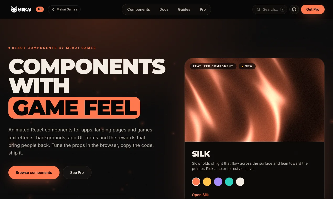
Mekai UI is our library of animated React components, live at ui.mekaigames.com. We spend our days making games feel responsive, and the library brings that same feel to apps, landing pages and games on the web: text effects, animated backgrounds, hover effects, app UI, forms, game UI and whole page blocks.
Today the catalog has 117 components in 8 categories, and 48 of them are free under the MIT license. Every component is a TypeScript file built with React, Tailwind CSS and Motion (the animation library formerly known as Framer Motion). It works in any React 19 project with Tailwind CSS 4: Next.js, Vite, React Router and others.
Each component has its own page with a live preview, controls to tune the props in the browser, the code, the props table and a short list of places where it fits. Below are six effects we reach for most often, what they do and when to use them.
React text animation: Split Text, Blur Text and Scramble Text
Split Text (free) splits a headline into letters that spring into place one by one when the text scrolls into view. Use it for big hero titles, section openers in a portfolio or chapter and level titles on a story-driven site. You can set the delay between letters and whether they come from the bottom or the top: ui.mekaigames.com/components/split-text
Blur Text (free) works on words instead of letters: each word sharpens out of a blur, one after another. It is calmer than Split Text, so it suits section headlines further down the page, short taglines and the opening line of an announcement: ui.mekaigames.com/components/blur-text
Scramble Text (free) decodes a label from random glyphs, left to right, on hover or focus. It is made for nav links and buttons, and for sci-fi or spy themed titles on game and studio sites: ui.mekaigames.com/components/scramble-text
All three respect prefers-reduced-motion: when a visitor has asked for less motion, the text simply appears. The text animation category has 21 components, 10 of them free, and our guide on which one to pick is at ui.mekaigames.com/guides/react-text-animations
import { BlurText } from "@/components/ui/blur-text";

<h1 className="text-6xl font-black">
  <BlurText text="Every frame earns its place" stagger={0.08} />
</h1>
Animated background in React: Aurora and Grainient
Aurora (free) is a set of soft, blurred color blobs that drift slowly in two layers. It fills its nearest positioned parent, so you drop it into a relative section and put your content on top. It fits behind the headline of a product landing page, on sign-in and onboarding screens and in welcome cards or empty states: ui.mekaigames.com/components/aurora
Grainient (free) is a grainy gradient mesh of up to four colors that slowly morph and lean toward the pointer. It renders on a canvas with WebGL, has a quality prop to lower the resolution on heavy pages, and a seed: each number gives a different, stable composition, which is handy when every page or event edition needs its own look: ui.mekaigames.com/components/grainient
Grainient pauses when it leaves the screen and shows a still frame when reduced motion is on. The backgrounds category has 19 components, 7 of them free, and the guide to animated hero backgrounds in Next.js is at ui.mekaigames.com/guides/animated-hero-background-nextjs
import { Aurora } from "@/components/ui/aurora";

<section className="relative h-[600px] bg-ink-950">
  <Aurora colors={["#ff784f", "#ffc24a", "#e2552b"]} speed={1} blur={70} />
</section>
Hover effects: Magnetic Button and Spotlight Card
Magnetic Button (free) is a call to action that leans toward the pointer and springs back when it leaves. A strength prop from 0 to 1 sets how strongly it follows. Use it once per page, on the main sign-up, download or buy button: ui.mekaigames.com/components/magnetic-button
Spotlight Card (Pro) is a card lit by a soft light that follows the pointer, with a matching border glow. It shines in pricing tiers, where the hovered plan lights up, and in feature grids or docs link cards that need a clear hover state: ui.mekaigames.com/components/spotlight-card
Blocks: a full hero in one component
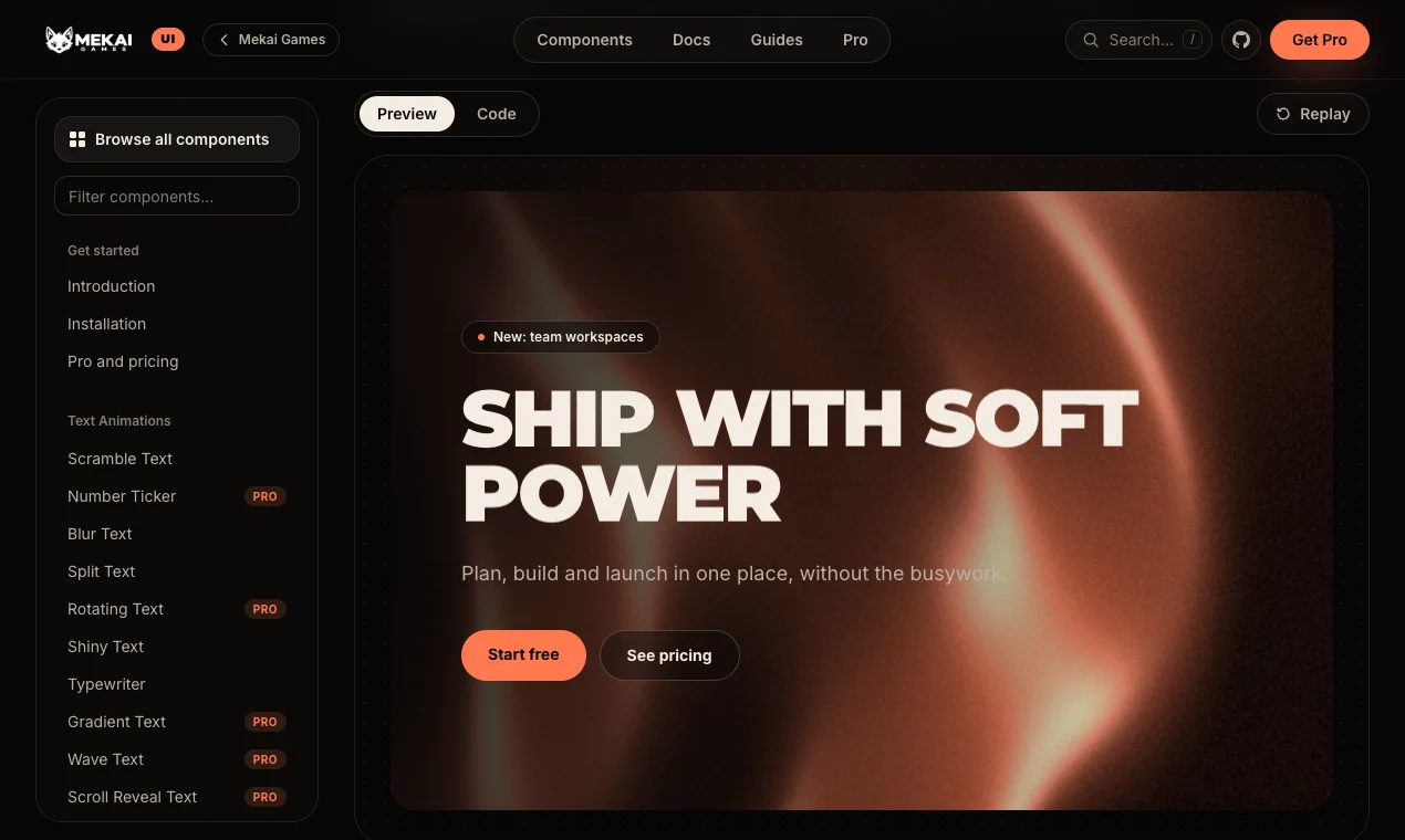
Blocks are whole sections built from Mekai components. Silk Hero (Pro) is a complete landing page hero: a live silk background behind a headline that blurs into focus, an eyebrow pill, a subtitle and two buttons. You pass the texts and links as props and pick one color for the silk and the main button: ui.mekaigames.com/components/silk-hero
It is meant for the first screen of a SaaS, app or agency site, and for launch pages that need one strong visual and a clear sign-up link. The Blocks category also has a Game Launch Hero and a Player Progress section: ui.mekaigames.com/categories/blocks
Game UI for apps, courses and games
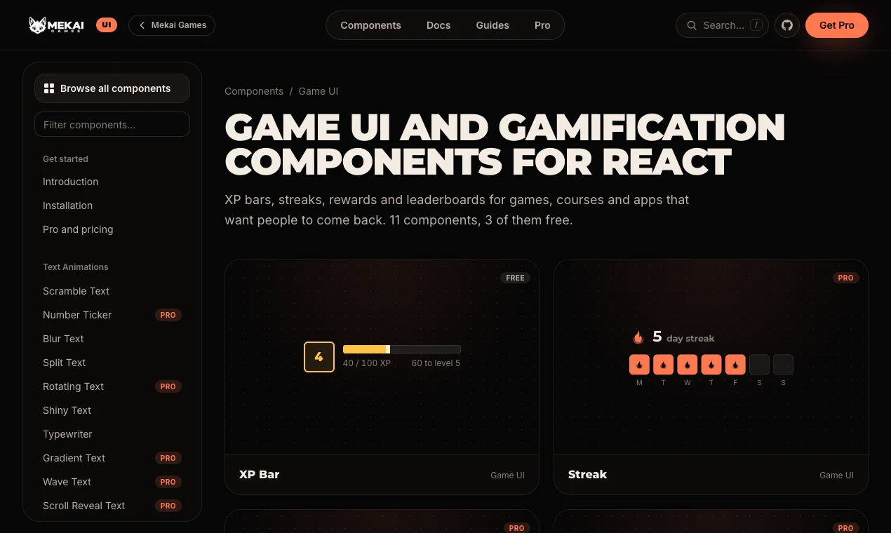
This is where our day job shows the most. The Game UI category has XP bars, streaks, leaderboards, rewards and more, for games and for any app that wants people to come back. XP Bar (free) shows a level badge and a spring-filled progress bar that bursts when the player levels up: you pass the total experience and it works out the level. It fits learner profiles, fitness or habit apps and game HUDs: ui.mekaigames.com/components/xp-bar
The category has 11 components, 3 of them free, and our guide to gamification UI in React is at ui.mekaigames.com/guides/gamification-ui-react
Install with the shadcn CLI, or copy the code
Free components install with the shadcn CLI. Use the address shown on the component's page: the CLI installs the dependencies and writes the file to components/ui, so the code lives in your project and you can change anything. If you prefer, install motion and paste the file from the Code tab instead. Step by step instructions are at ui.mekaigames.com/get-started/installation
The free components also live in a public GitHub repository under the MIT license: github.com/mekai-ui/mekai-ui
npx shadcn@latest init
npx shadcn@latest add https://ui.mekaigames.com/r/split-text.json

import { SplitText } from "@/components/ui/split-text";

<h2 className="text-5xl font-black uppercase">
  <SplitText text="Ready for launch" from="bottom" />
</h2>
Free, Pro and Team
The 48 free components are free forever. Pro costs 39 euros once, for one developer, and Team costs 199 euros once, for up to 10 developers. Both unlock all 117 components with lifetime updates, no subscription and unlimited projects, client work included. Prices include VAT where it applies.
After checkout you are invited to a private GitHub repository with every Pro component, and new components and fixes land there too. Plans and details are at ui.mekaigames.com/pro